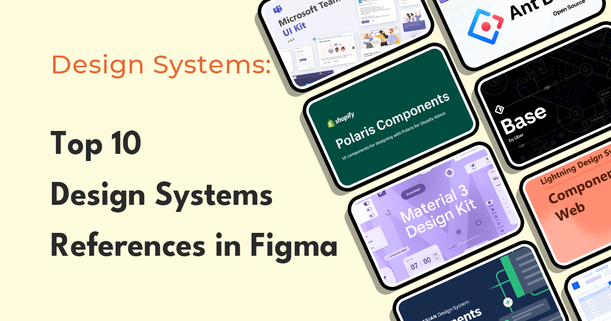
Design systems have become an essential part of every designer's toolkit. They are a collection of reusable components, guidelines, and best practices that help designers create consistent and cohesive designs. Figma has become a popular tool for building design systems because of its collaborative features and its ability to create responsive designs. In this article, we will take a look at the top 10 design systems templates built in Figma that are available to designers.
10 Figma Toolkits for Design Systems Reference
We have selected 10 prominent toolkits, tried to list them down in descending order according to their popularity indexes such as number of likes and downloads. So here are top 10 Design Systems references built in Figma.
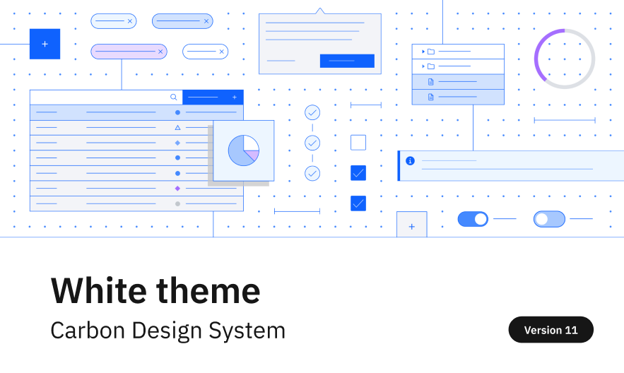
#10. Carbon Design System by IBM
IBM created Carbon Design System to support the adoption of Figma across IBM. By creating a living library of IBM Design Language patterns and Carbon components, IBM expected their designers, developers, and teams to boost overall productivity. Thanks to Carbon’s open-source mission, this open-source library was published publicly in the Figma Community. Their design systems toolkits are available in different themes:
Popularity Stats
- Likes: 235
- Downloads: 6.1K
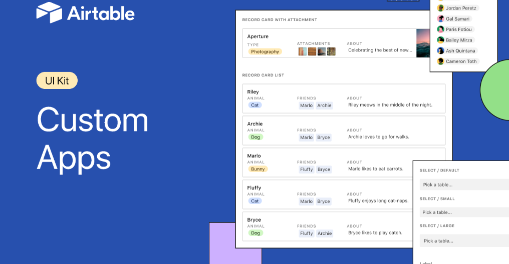
#9. Custom Apps UI kit by Airtable
Airtable built this UI kit for the product makers to build apps on top of Airtable. If you are planning to develop an app to register inside Airtable, this is a good kit to try.
Popularity Stats
- Likes: 720
- Downloads: 19.6K

#8. Chakra UI
Chakra UI is another popular UI kit that many designers take as a reference for their works. It includes extensive styles for typography, color, and effects, component variants including size and state, now also with interactions, dynamic layers powered by auto layout, and implicit pixel grid sizes and spacing.
Popularity Stats
- Likes: 1.2K
- Downloads: 31.2K

#7. Windows Teams UI Kit by Microsoft
The Microsoft Teams UI Kit includes UI components, templates, best practices, and other resources for creating Teams app. This kit is built to help the app makers to focus on users’ needs, understand how and where people use Teams apps, and apply tested designs. If you have any part in creating a Teams app, this is definitely the right reference to use.
Popularity Stats
- Likes: 2k
- Downloads: 47K
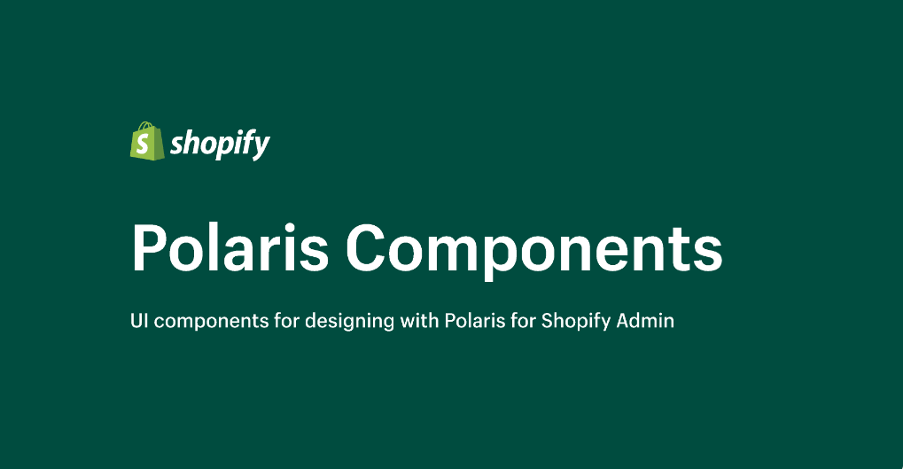
#6. Shopify Polaris Design System
Shopify's Polaris Design System is the UI kit that provides all the components, styles, and icons used when designing Shopify admin. Like Atlassian Design System, the kit is divided into different parts including:
Popularity Stats
- Likes: 842
- Downloads: 26.9K

#5. Salesforce Lightning Design System
Salesforce's Lightning Design System includes the resources to create user interfaces consistent with the Salesforce Lightning principles, design language, and best practices. If you are on the team that builds Salesforce Lightning apps, this would be the right reference to look at. Just like some of the other examples, Lightning Design System’s UI kit is divided into different parts as listed below:
Popularity Stats
- Likes: 2.1K
- Downloads: 65.5K

#4. Uber Base Design System
Uber's Base Design System was created to promote a centralized library of reusable UI components for Designers and Engineers in Uber team. If you like Uber’s UI/UX and want to benchmark it, this is a good source to use.
Popularity Stats
- Likes: 3.8K
- Downloads: 70.4K

#3. Atlassian Design System
One of the characteristics of Atlassian Design System is that the system is divided into a number of projects: one for components, design tokens, and foundations each. Also, the design systems kindly feature the ‘Get Started’ guideline to help the users to know how to use the design systems. You may refer to this to know how to write such guidance to share with your team. The links to each part of the design system are listed below:
Popularity Stats
- Likes: 2.8k
- Downloads: 88.9K

#2. Ant Design System
Ant Design System is a popular design system that has been used by many to create applications and websites across various industries. Different companies are using this design system for building products. Some examples include:
Popularity Stats
- Likes: 6.6K
- Downloads: 123K
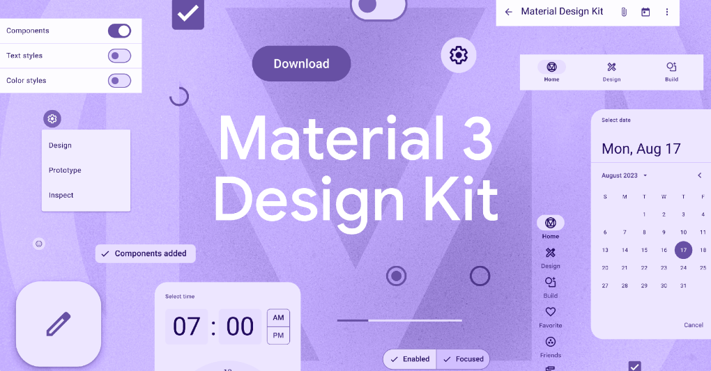
#1. Material 3 Design System by Google
Google's Material.io team created this Design kit with documentation and guidance for how to use the components and styles. This design kit is famous for its modern styling, adaptive guidance, and color. You may refer to how typography, icons, colors, and components are organized in this kit.
Popularity Stats
- Likes: 12.3K
- Downloads: 306K
These design system templates provide a solid foundation for product designers to create their own custom design systems. However, it's important to note that these templates should be used as a starting point, and not as a final product. Designers should customize and tailor the components and design tokens to fit their specific needs and brand identity.
Best Practices to Build Custom Design Systems in Figma
Then the question is ‘What are the best practices to build design systems?’ Building a custom design system can be a daunting task, but it is an essential step toward creating consistent and cohesive designs. Here are some best practices for building a custom design system in Figma:
1. Define the purpose and scope of the design system
Before start building up the design system, you should first determine what components and guidelines are necessary for the design system to achieve its objectives. To determine these, you may need to go through rounds of discussions and interviews with internal stakeholders.
2. Use a modular approach
To ensure the usability of the design system, it is recommended to break down the design system into smaller components. How small should the components be? You just need to make sure the components are small enough to be reused across designs.
3. Create clear documentation
It is important to document each component and guideline in the design system to ensure consistency across designs and to make it easier for others to use. Otherwise, a team may not adopt the design system.
4. Collaborate with other product designers and developers
Collaboration and feedback from other designers and front-end developers should be encouraged to ensure the design system meets their needs and is easy to use.
5. Test and iterate
Lastly, you should test the design system in different scenarios and iterate based on feedback to ensure it's effective and meets the needs of the users.
As these practices show, building and documenting design systems in Figma is not an easy task. That is why FUNCTION12 is developing new features related to design systems documentation soon. The features may include:
- Automating design systems documentation based on Figma design input
- Real-time sync between Figma design change and design systems document
- Pushing components and design tokens in the design system document to Figma for reusability
With these features, we believe the process of creating and maintaining design systems will become easier and more efficient.
Final Words
In conclusion, design systems are a vital part of every designer's toolkit, and Figma provides an excellent platform to create them. By using the top 10 design system templates built in Figma and following the best practices outlined in this article, both product designers and developers can create custom design systems that will improve the consistency and efficiency of their design work. And with the upcoming release of the design systems documentation automation feature, design system builders will be able to take their design systems to the next level.
Credit to Design Systems for Figma
Related Posts
 Team FUNCTION12
 Team FUNCTION12


