
Front-end development is a complex process that requires a lot of attention to detail. To create an intuitive and visually appealing user interface, developers must have a solid understanding of the tools and libraries they are working with. This is where UI library documentation comes in. By providing detailed and comprehensive documentation, UI libraries can help developers navigate the front-end development process more efficiently and effectively.
The Importance of Detailed UI Library Documentation
Detailed UI library documentation is critical to the success of front-end development projects. Without comprehensive documentation, developers may struggle to understand how to use the library's components properly, leading to bugs, errors, and delays in development. Clear documentation can also help ensure consistency in the implementation of components, making it easier for developers to collaborate on projects and reducing the likelihood of conflicts arising from different interpretations of the library's functionality. Furthermore, detailed documentation can save time and effort in the long run, as developers can quickly reference the documentation to troubleshoot issues or understand how to use specific features of the library. Overall, investing in detailed UI library documentation can help ensure the success of front-end development projects, improving the user experience and reducing development time and costs.
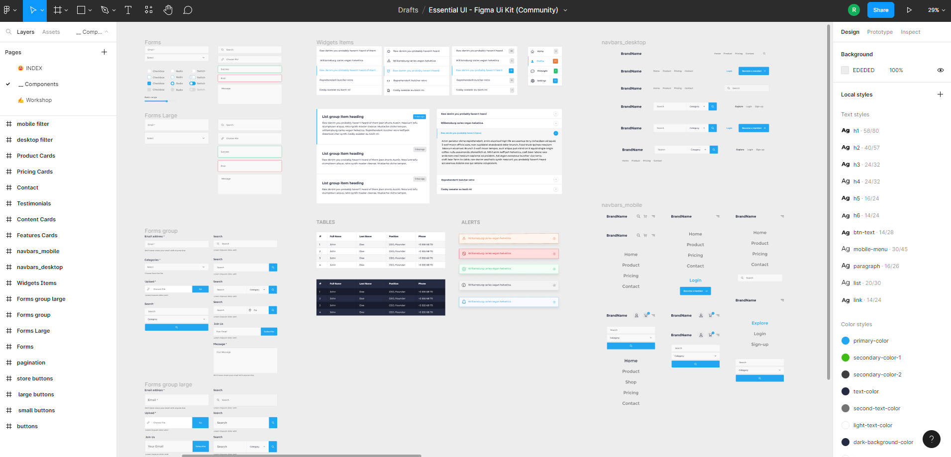
In addition to the importance of detailed UI library documentation, it's worth noting that tools like Figma can be incredibly useful for building UI libraries. Figma is a design tool that enables designers to create and share UI designs, including components like buttons, forms, and icons. By building a UI library in Figma, designers can create a shared resource that developers can reference when building out the front-end of a website or application.
Figma allows designers to define styles and components in a way that can be easily shared and reused, ensuring consistency and saving time for the development team. Additionally, Figma makes it easy to export assets and styles in a variety of formats, including CSS, which can be directly integrated into a project's codebase.
By combining detailed documentation with a UI library built in Figma, development teams can streamline the front-end development process, reducing errors and speeding up development time. Ultimately, this can lead to a better user experience and a more successful project overall.
How to document UI library
When documenting a UI library, it's important to provide clear and concise instructions on how to use each component. This can include providing code examples, explaining how to customize the component, and outlining any dependencies or requirements that need to be met. It can also be helpful to include visual aids, such as screenshots or diagrams, to illustrate how the component should look and function. Additionally, it's important to keep the documentation up-to-date and relevant, especially if the library undergoes updates or changes. Overall, providing comprehensive documentation can help make it easier for developers to use the UI library and ensure that their projects are successful.
The Benefits of Using UI Libraries
Using UI libraries in front-end development can provide several benefits, such as reducing development time and effort. Instead of building UI components from scratch, developers can utilize pre-built components provided by the library, saving time and effort. Additionally, UI libraries often come with detailed documentation that can make it easier for developers to implement the components into their projects. This documentation can provide detailed instructions, code snippets, and even examples of how to use the components in different scenarios. Overall, using UI libraries can help improve the efficiency of front-end development and provide a better user experience for the end-users.
Best Practices for Using UI Libraries : Storybook, Widgetbook
Two popular tools for creating detailed UI component library documentation are Storybook and Widgetbook. Storybook is an open-source tool that enables developers to build UI components in isolation, allowing them to test and refine components in a sandbox environment. It also provides a platform for documenting each component, including detailed information on how to use and customize the component. Widgetbook, on the other hand, is a commercial tool that offers similar capabilities, including the ability to build, test, and document UI components. Additionally, Widgetbook provides an interactive playground for each component, allowing developers to test and customize the component in real-time. Both Storybook and Widgetbook can help streamline the front-end development process and provide developers with the detailed documentation they need to effectively use UI component libraries in their projects.
Challenges and Considerations
While UI libraries can be incredibly helpful in front-end development, there are some challenges to consider. One challenge is ensuring that the library is compatible with the project's other tools and components. Another challenge is ensuring that the library is well-documented and up-to-date. To overcome these challenges, it is important to carefully review the library's documentation and to test it thoroughly before using it in a project.
Conclusion
UI library documentation is an essential resource for front-end developers. By providing detailed and comprehensive information on library components and functionality, UI libraries can help developers navigate the front-end development process more efficiently and effectively. While there are some challenges to consider, the benefits of using UI libraries are clear, and they are an important tool for all front-end developers to consider using.
Related Posts
 Team FUNCTION12
 Team FUNCTION12


%20library%20documentation)