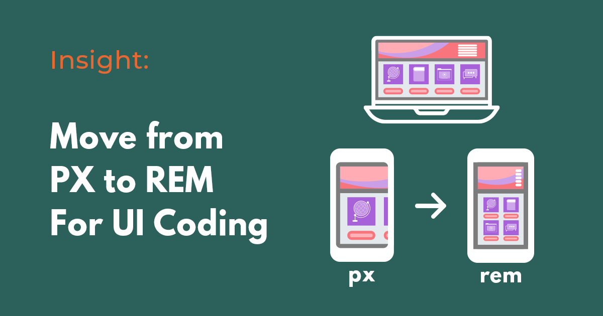
Over the last years, it has been the trend that web designers and app UI/UX designers prefer delivering design specifications to developers via Figma link. During this design handoff process, many designers would stress that their designs should be designed pixel-perfect, and some of you may follow their suggestion. But is that an optimal decision for web or app development?
What is the issue with coding in terms of PX values?
Pixel is an absolute and fixed-size unit in CSS. Normally, the font-size, margin, and padding are defined in pixel values and they remain the same for all the screens. However, writing code in PX can cause some issues.
One such example is overruling the font size preferences set by users once translated to CSS. Even though user changes the root font-size values on their browsers, they will not affect the font size displayed.
Even though PX values do not hinder users to use zoom in/out functions to view the website, using REM is recommended when it comes to developing a responsive web.
What if we use REM instead?
In CSS, REM stands for “root em”, a unit of measurement that represents the font size of the root element. Unlike PX, REM is a relative unit corresponding to the root font size, and it is normally expressed like the following in CSS.
html{
  font-size:16px
}

p{
  font-size:1rem;
}
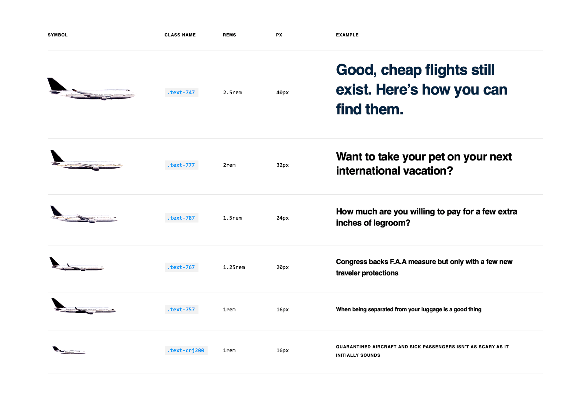
Most of the time, the default font size is 16px, so 1 rem is equivalent to 16px. However, if the user changes the root font size to 24px, 1 rem is equal to 24px.
Then how can we derive the rem values of other font sizes? You just simply need to divide the font size value into the root font size. An easy way to understand rem is to take it as %. 1 rem is 100%, and 2 rem is the same as 200%.
But Figma does not provide REM. What should you do?
Surprisingly, Figma only provides PX values to its users. This means either UI.UX designers or developers need to seek a way by which REM values can be derived based on the design specification provided by Figma design. What is the existing solution to this issue?
#1: Manually Translate PX to REM via PX to REM converter tool
This is an obvious solution that most developers know. Thankfully, there are a number of converting tools out there, which can reduce the time for calculating rem values.
Some of these examples include:
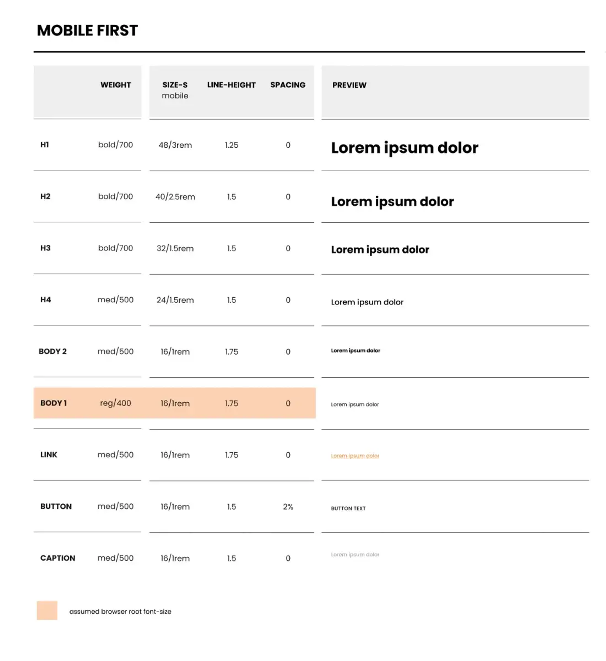
#2: Define PX and REM Values in the Stylesheet
You may communicate with UI/UX designers to come up with a stylesheet. This is to remind you and everyone in the team that the end result must be in the relative units according to the ones in the stylesheet. Many have come up with Typography stylesheets, and you may take their reference for your work:
However, both the first and second methods are very manual and time-consuming. Is there any way to automate all these? If you have such a need, FUNCTION12 is the right method for you.
#3: Use FUNCTION12
FUNCTION12 converts Figma design into HTML/CSS code automatically. FUNCTION12 provides rem-based code, not pixel-based code, with a single Figma design URL import, so it can reduce your time to look around and calculate rem values one by one. Below is an example of the code provided by FUNCTION12.
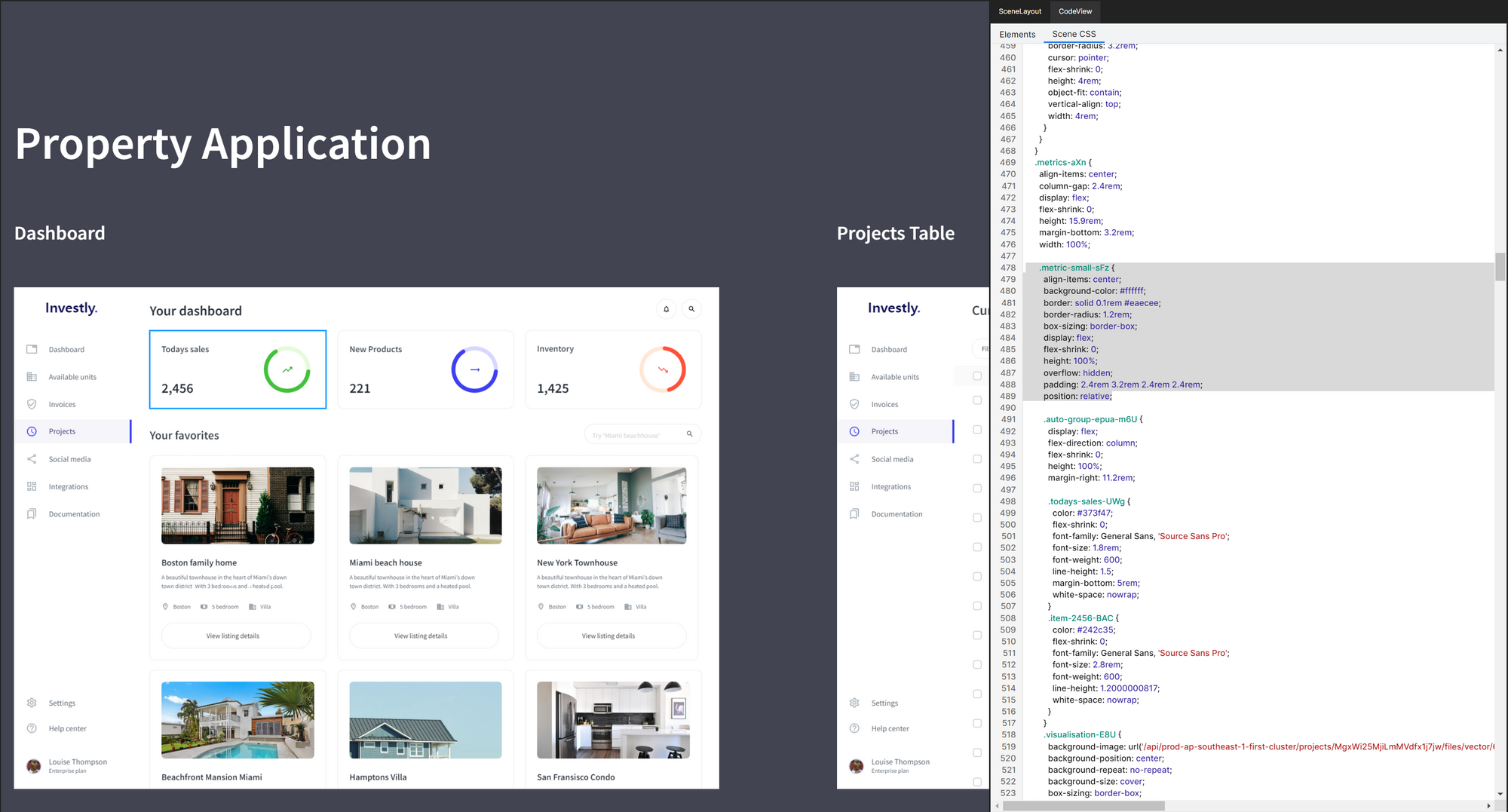
.metric-small-sFz {
        align-items: center;
        background-color: #ffffff;
        border: solid 0.1rem #eaecee;
        border-radius: 1.2rem;
        box-sizing: border-box;
        display: flex;
        flex-shrink: 0;
        height: 100%;
        overflow: hidden;
        padding: 2.4rem 3.2rem 2.4rem 2.4rem;
        position: relative;
FUNCTION12 provides rem values for border, border-radius, padding, margin, font-size, etc., potentially boosting the developers’ productivity. Additionally, users can manually edit these size values within FUNCTION12 itself (except font-size), so it provides flexibility to its users to a certain extent.
Final Words
Whether you use rem or not depends on the objective of your development project. However, if you consider developing a responsive website, we believe using rem values would be essential, and you may need to convince the designers not to stress ‘pixel-perfect’ (But obviously, they need to provide UI design in correct px values). If you have more questions about this topic, you may visit our help center or Discord server to leave your inquiries.
Related Posts
 Team FUNCTION12
 Team FUNCTION12

