You've probably heard the name Figma more often over the last few years, but maybe not many of you have already used it. Designing with Figma is a fairly new browser-based design practice. Since you don’t need to install it or buy expensive licenses to give team members access to design files, design has become much more accessible. Because of this, many developers now find themselves in need of learning this design tool. But the problem is that not many know how to start learning Figma, and which features are relevant to their job.
Because many developers don’t have a lot of experience playing around with design tools, we’ll cover all the basics developers need to know about Figma so you can confidently navigate through the designs and extract any information you might need when working with them.
We’ll also discuss some Figma features that make it easier for developers to develop their projects, such as providing CSS information about the design’s elements.
Why Figma?
An obvious reason why developers should get to know more about Figma is that many UI/UX designers have adopted Figma to design UI/UX. To work with them, developers even have to get access to Figma to understand the designers’ motives. Read our previous blog to find out more about why developers should learn Figma.

How to start using Figma?
When you are added as a collaborator on a Figma design, you can either open it in the browser or download the desktop app (available on Windows and macOS). The cross-platform electron app, like Slack and Visual Studio Code, is available for Windows and macOS. The browser and desktop versions have similar functionality, although the desktop version has built-in support for using local fonts while the browser version requires the Figma Font Helper plug-in to do so.
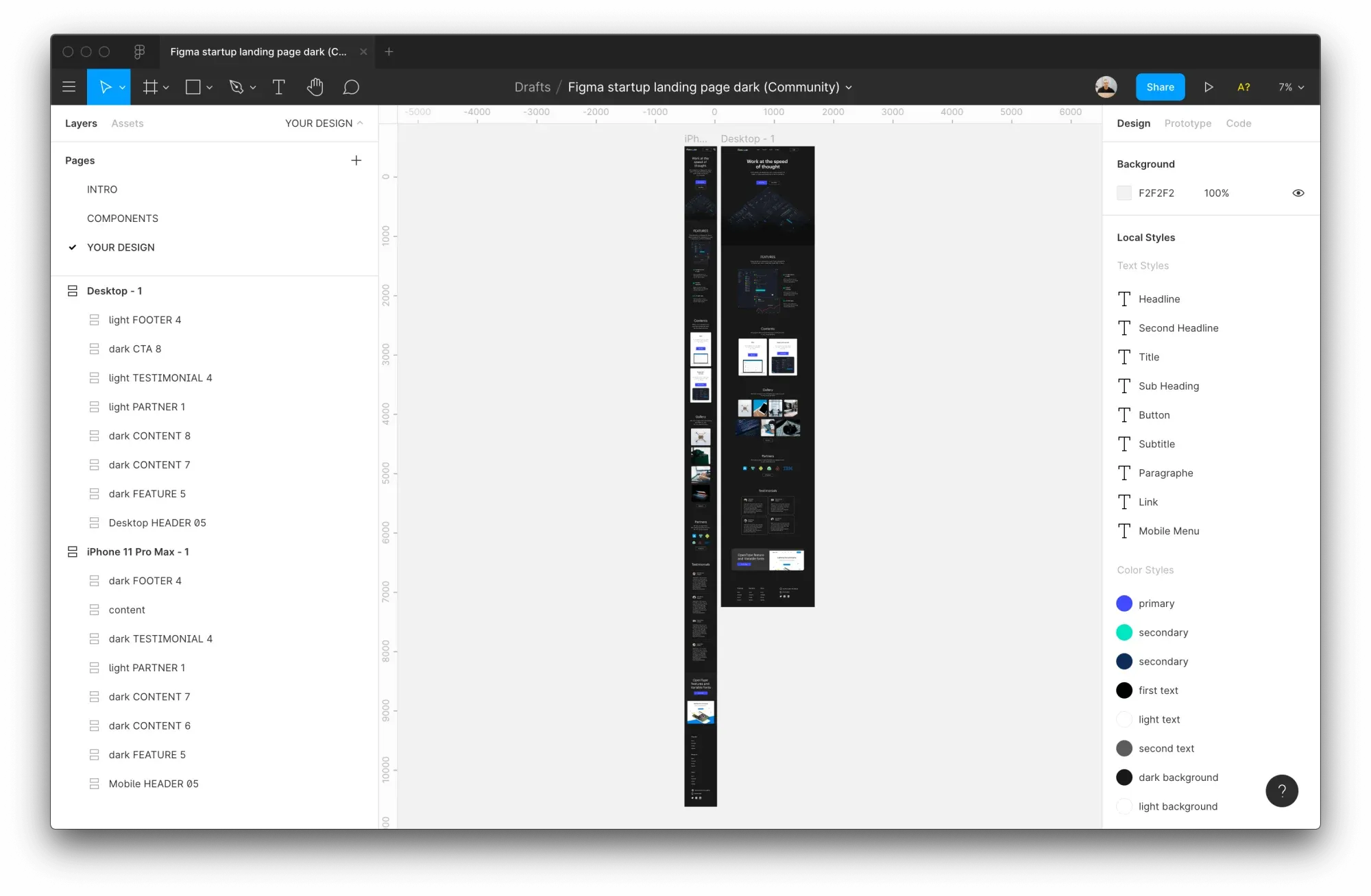
The interface of Figma is split into three main sections. On the right side, there is a toolbar that provides all the information about the file's elements. On the left side, you'll find a sidebar containing layers, assets, and pages. The main canvas is in the middle, where all the designs are displayed.
A file can have multiple canvases in a single canvas, but every canvas is restricted to one file. Designers often use canvas to separate and organize file parts on separate canvases for design systems, icons, or other file assets.
When you open a file, you will begin on the highest zoom level that fits all the frames in the visible area.
You don't need to commit these shortcuts to memory just yet; you can always check out these and other available shortcuts by pressing Cmd + Shift + ?.

After you have used a shortcut, the used shortcut will turn to a blue color, so you can easily see which ones you still have to learn.
When you first open a new file, be sure to familiarize yourself with its various pages. If the designer you are working with has separated out all the colors, fonts, and icons into their own pages, you will save time when building the design.
Key Features to learn in Figma as a developer
You don’t need to learn all the features in Figma as the software is primarily designed for designers’ work. If you are a developer, you just need to check out the features we listed down here.
1. Project type
It's helpful to establish all the fundamental styles when opening a new project. You can see all the project styles in the right sidebar on Figma. Here, you can locate all the typography, colors, grids, and other styles utilized in the design.
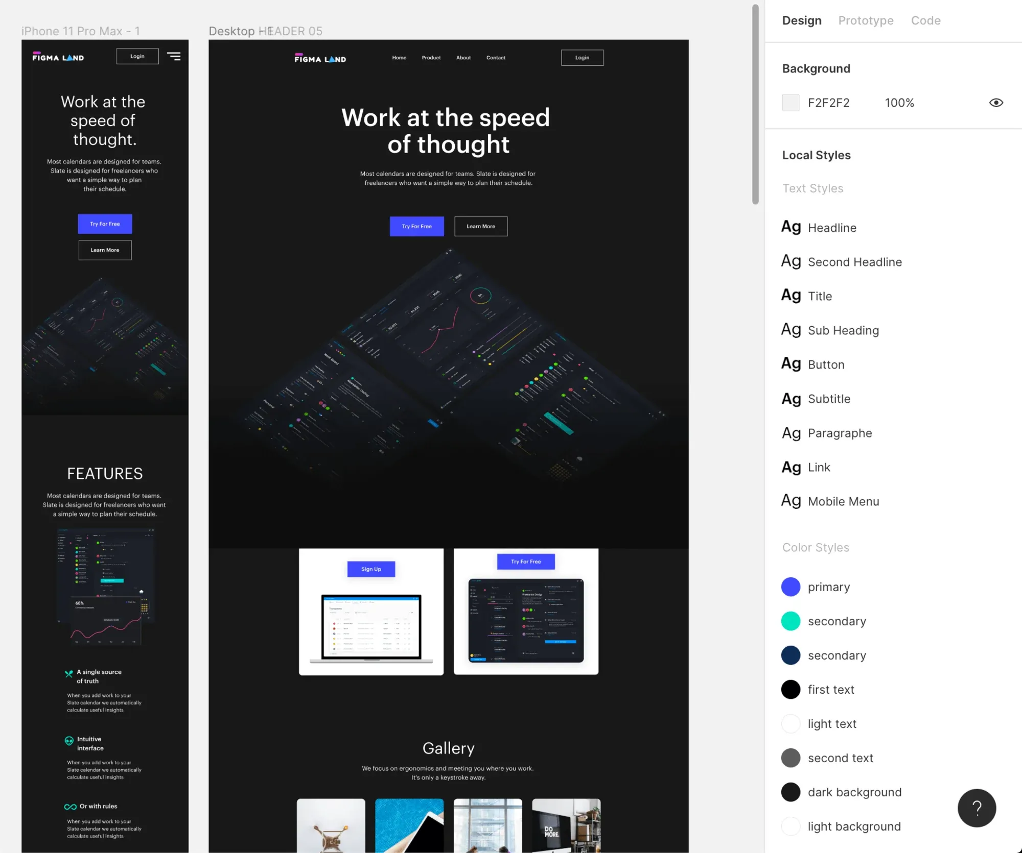
The project styles will only display if no element is selected. To view the project styles, click anywhere on the canvas or press Esc if you've chosen something else.
This data can be used to establish your CSS layout, variables, and fonts. Simply click on the edit icon next to the style element to find out more about it.
View and edit project styles from Smashing Magazine on Vimeo.
2. Element selection
Once you’ve established the fundamentals for your project, you can begin designing. The most vital thing in deconstructing a design is selecting elements and gathering information about sizes and styles.
A design may contain multiple levels of nesting for elements, so selecting a layer is not as simple as clicking on an element. Only the top-level element is selected when an element is clicked.
You can choose a particular layer by holding Command ⌘ while clicking, or you can open a menu of all the nested layers and choose the appropriate one by right-clicking an element.
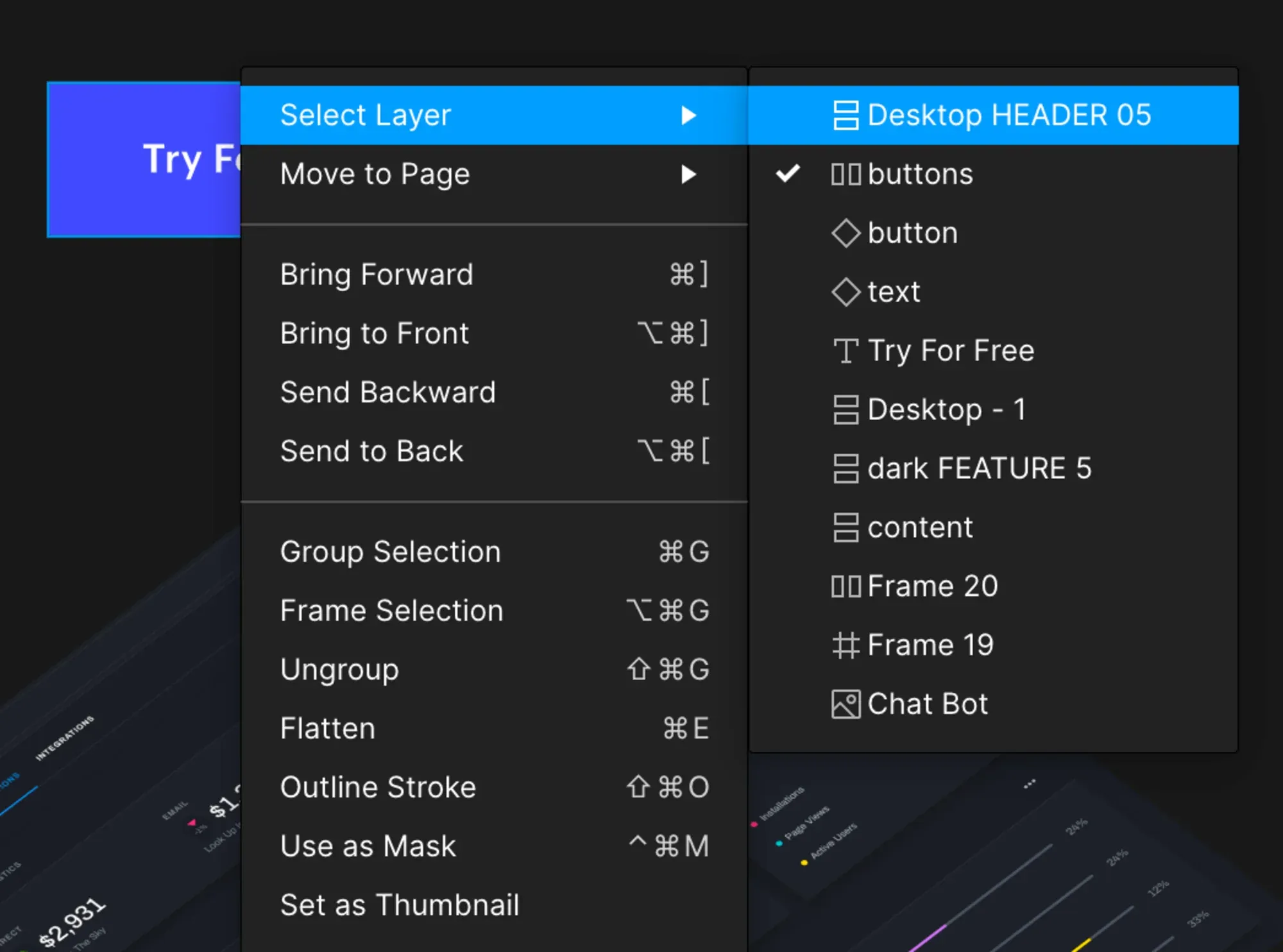
Every time you double-click an element, it will select one nesting level lower. This is a great way to drill down into an element until you reach the desired item.
This article covers the basic ways to select and navigate layers, which are used 80% of the time. Figma’s documentation teaches more ways to select and navigate layers.
When you choose an element, the Code tab in the right sidebar shows you all the CSS information about that element.
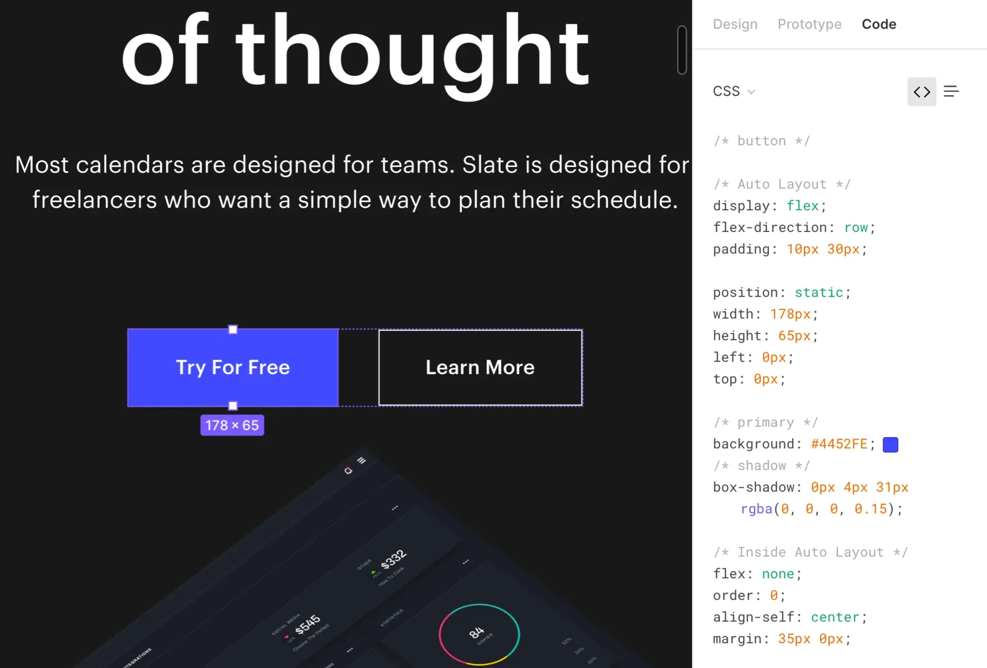
It is crucial to understand that CSS is automatically generated and that positioning elements are particularly difficult to position. Do not copy CSS 1-to-1 to your project, but rather use it as a guide and a quick resource for information.
3. Position and space
To correctly position elements, measure spaces between elements, or set the right margin or padding, all you need to do is select the element you want to measure from, then hold Alt and hover your mouse over the element you want to measure the distance to.
Measuring distance between elements. from Smashing Magazine on Vimeo.
Figma will indicate the distance between elements with a red line, indicating the distance in pixels. If you want to measure the distance to a specific child element in another group or frame, you can hold the Cmd ⌘ key just as you would when selecting an element to deep-select it.
4. Exporting
Previously, designers would frequently have to export all assets as most developers did not have design software installed on their machines. With Figma, you now have complete access to the designs and can export everything yourself.
The first step in exporting an asset is to flag it as such. You accomplish this by selecting the element you want to export and clicking the plus sign next to the Export heading in the right sidebar.
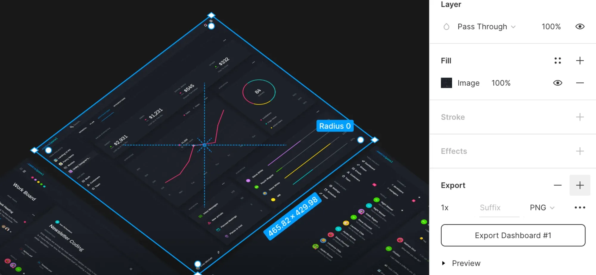
There are various export settings for different file types when exporting images. You can choose the file type (PNG, JPEG, SVG, or PDF) for images, and there is only a scale multiplier. The layer name will be used as the file name, but you can add a file name suffix. You can then export the selected element by using the export button.
You can quickly export an asset by right-clicking it, hovering on Copy/paste, and copying the image or SVG code. This is beneficial if you don't want to have custom export settings and just want a quick copy of a single element.
You can choose to export a single asset or all exportable assets at once, but you can also export all assets that are exportable at once.
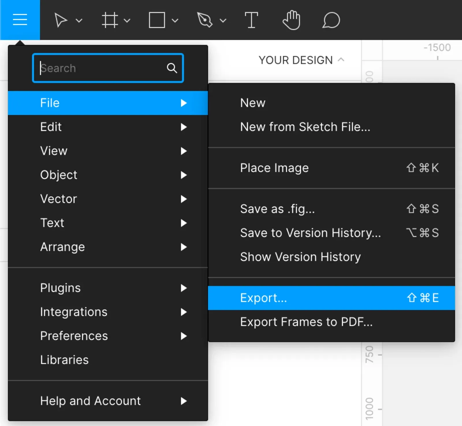
On macOS or Windows, you can use the Shift+Cmd+E shortcut under the File menu to export all the design assets at once. If you want to export everything at once, you can go to the main menu and click Export.
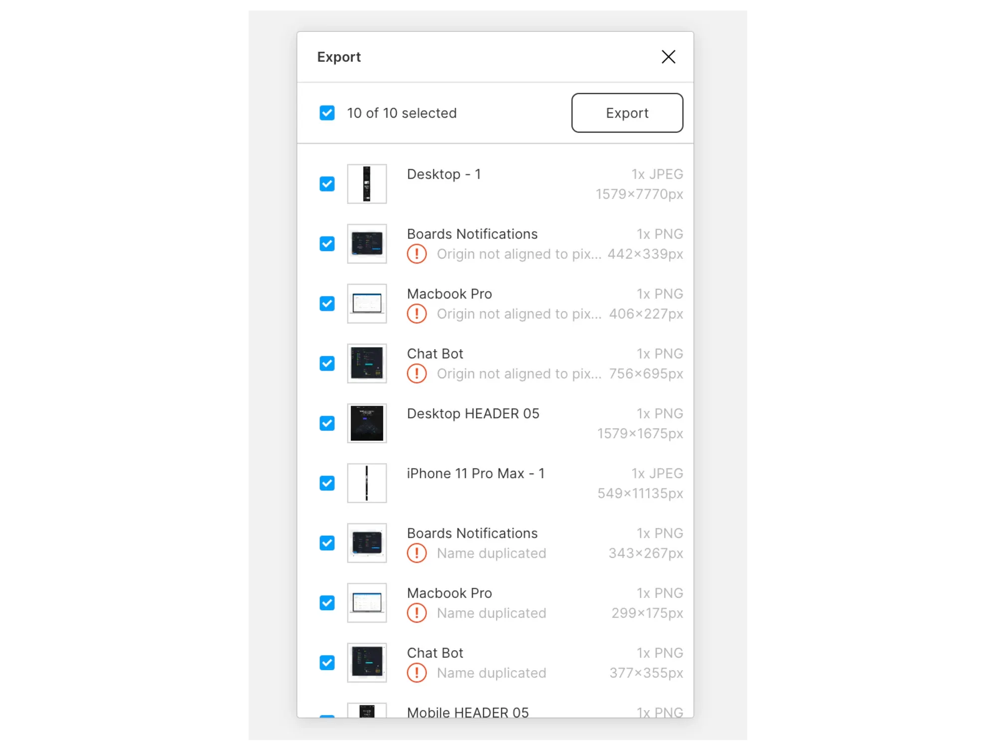
You can inspect the dimensions, and file type, and exclude any files before making the final export using this list of all the items in the file that are marked for export. By hovering over the thumbnail of the assets, you can see the file name that the asset will have after it is exported.
When you want to modify an exported asset, click on the thumbnail to select the element in the canvas and then adjust the export settings.
You can use a slash “/” in your layer name to indicate a group of exportable assets if you have a lot of them in a single file. Figma will then automatically create a folder for that group and export the assets within it to a subfolder.
5. Transitions and animations
Figma also provides a wide range of transitions between pages, modal openings, swipe and drag actions on mobile, and other animations. You can view these animations by clicking the play button in the top right corner to open Presentation mode.
Select the Prototype tab in the right sidebar to view the information about animation in the canvas, where you’ll see the user flow displayed in blue arrows.
Double-clicking on the arrow displays all the relevant data about that particular animation. Each animation comprises a trigger, a motion, and a transition.
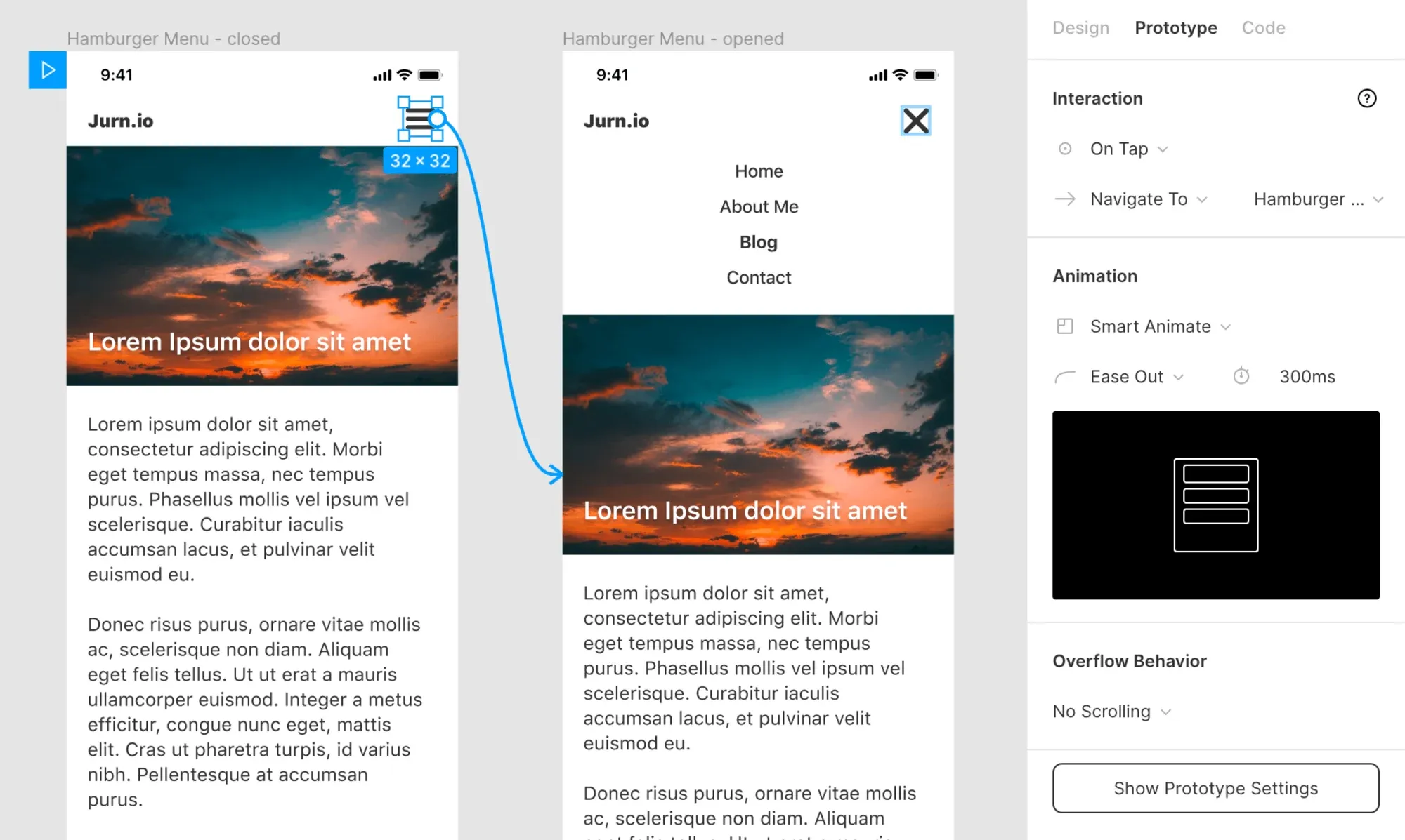
Here, you can see a simple animation opening a hamburger menu. You can see that the hamburger icon has an On Tap trigger; once it is triggered, it will Navigate To the mobile menu screen, which is in an open state. In this case, Figma automatically interpolates between two states using a Smart Animate transition, which is an Ease Out animation function with a 300ms duration.
The exact replication of CSS animations is dependent on having the right information, but this information isn't available in the Code tab!
6. Sharing notes with the team
You can ask someone else on the project for clarification if anything is unclear. You can request more information by clicking on the chat bubble icon in the top toolbar or by pressing the C key to switch to the Comment tool.

You can now start typing a comment or question about any element in the design by clicking anywhere and typing. Once you have finished, you can press the V key to return to normal cursor mode.
It is important to note that not everyone will receive a notification that you have commented. In order to guarantee that someone sees your comment, you should mention them using the @ symbol just like on Slack or Twitter.
All comments are publicly visible on the design, as there are no private comments/chats. Once the problem has been fixed, the comment can be greyed out to indicate this.
My final thoughts
Figma has provided you with everything you need to know about typography, colors, positioning, and padding of elements. You should be able to extract information from any Figma design file that is sent to you. You can extract information about colors and typography, measure margins, padding, and position, export assets, and collaborate with other team members.
Figma’s documentation is a great place to start if you want to learn more about the tool, or you can search for more information on a specific feature when you want to learn more about it.
Related Post
