For a front-end developer, the importance of a well-documented component library cannot be overemphasized. Component libraries, if crafted and maintained with care, can significantly streamline the development process, ensure consistency across projects, and foster collaboration between designers and developers.
What is a Component Library?
A component library is a collection of reusable UI components, such as buttons, forms, modals, and navigation bars, that are coded and styled consistently. These components can be integrated into different parts of a project or even multiple projects, ensuring that the UI remains consistent throughout.
Why Documentation?
A well-documented component library ensures:
- Ease of Use: Developers can quickly understand how to use the component without diving deep into the code.
- Consistency: Ensures that components maintain a uniform look and feel, irrespective of who is using them.
- Maintenance: If the components are updated or modified, proper documentation guides the changes and informs users.
Key Elements of Effective Component Library Documentation:
- Introduction: Start with an overview. Why was the library created? What are its primary goals? This sets the context for the developer.
- Installation and Setup: Instructions on how to integrate the library into projects.
- Component List: A well-organized list of available components. This might include:
- Thumbnails or preview images
- Component names
- A brief description
- Detailed Component Breakdown:
- Description: What is the component used for?
- Properties & Methods: List and explain different properties, methods, or events associated with the component.
- Usage Examples: Include code snippets showing basic and advanced use-cases.
- Styling: Explain customization options, if any.
- Dependencies: Does the component rely on other components or external libraries?
- Accessibility: Details on how the component meets accessibility standards.
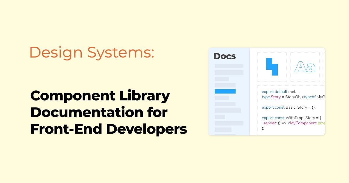
- Interactive Demos: Allow users to play with components. Platforms like Storybook can be invaluable for this.
- Version History: A log of updates and changes made to components over time.
- Contribution Guidelines: If it's an open-source library, how can others contribute?
- FAQs and Troubleshooting: Common issues users might encounter and their solutions.
- Feedback Loop: Provide ways for developers to provide feedback or report issues.
Popular Tools for Documenting Component Libraries:
- Storybook: An open-source tool that provides a sandbox to build and view components in isolation.
- Docz: Helps you document your components with a zero-config setup and provides a playground for props tweaking.
- Styleguidist: Isolates components and offers an area for documentation, allowing you to create a live style guide.
Final Thoughts:
As the digital landscape becomes more complex, the need for organized and efficient development processes becomes paramount. Component libraries, backed by comprehensive documentation, are pivotal in meeting this need. They not only enhance productivity but also promote a collaborative spirit among teams.
Remember, a component library without proper documentation is like a library without a catalog. It might contain a wealth of information, but accessing and utilizing that information becomes a challenge.
Happy coding!
Related Posts
 Team FUNCTION12
 Team FUNCTION12

